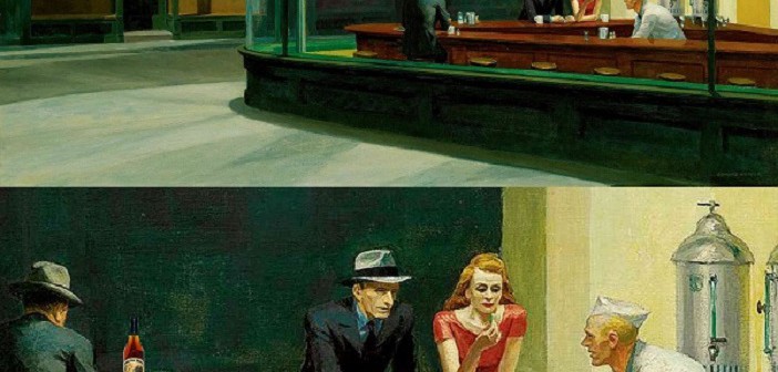
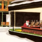
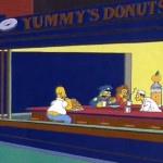
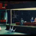
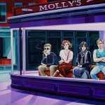
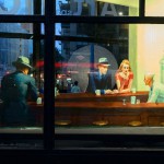
Edward Hopper’s iconic 1942 painting of a diner at night in Greenwich Village, New York City, is austere. Yet he said of his paintings, “To me the most important thing is the sense of going on.” So in this TD classic update we’ve added one for the road.
Edward Hopper is considered the quintessential realist painter of 20th Century American Art, who, in the words of one critic, “portrayed the commonplace and made the ordinary poetic.” And so he did. “Nighthawk” is timeless and it could be anywhere: at some point we have all felt the isolation and loneliness we see here.
Hopper’s paintings are a study in the effect of light on wood, buildings, objects and occasionally people. His favorite subjects were houses and lighthouses in sunlight, but here we see him focused on artificial light at night. Fluorescent light had just been invented, hence the eerie glow from that source of light: it casts a “shadow” over the entire canvass.
It’s an extraordinary painting, but it doesn’t look like a fun place to be. We can’t get in. They can’t get out. There is no entrance, no exit—they are glassed in. We don’t know why there is no entrance. We don’t know what’s going on in there. No one is engaged, but the waiter may be asking if they want anything else. Regardless, Hopper achieved what he was after—we are drawn to the light and the effects of the light.
“Nighthawk” was a collaboration between Edward and his wife Josephine (Jo) who served as the model for the lady in red. She had an art background and served as his “scout”. Here are her notes on the site which this source saysdefinitively was 70 Greenwich Avenue at 11th Street in Manhattan. (The link shows the surrounding buildings of the location today and concludes they are part of the exterior setting for the diner.)
Jo Hopper writes: “Night + brilliant interior of cheap restaurant. Bright items: cherry wood counter + tops of surrounding stools; light on metal tanks at rear right; brilliant streak of jade green tiles ¾ across canvas—at base of glass of window curving at corner. Light walls, dull yellow ocre [sic]door into kitchen right…
“Very good looking blond boy in white (coat, cap) inside counter. Girl in red blouse, brown hair eating sandwich. Man night hawk (beak) in dark suit, steel grey hat, black band, blue shirt (clean) holding cigarette. Other figure dark sinister back—at left. Light side walk outside pale greenish. Darkish red brick houses opposite. Sign across top of restaurant, dark—Phillies 5c cigar. Picture of cigar. Outside of shop dark, green. Note: bit of bright ceiling inside shop against dark of outside street—at edge of stretch of top of window.“
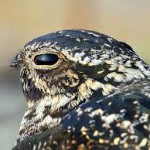
Now I’d say he nailed it. Here is how he took her notes and created a storyboard for the painting. Jo’s notation that the man in the middle had a nose like a hawk was the source of the title for the painting.
The folks over at smarthistory.org have this video with additional insights to “Nighthawks.” Worth a look.
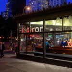
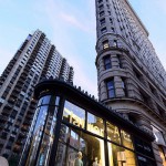
A fun project a couple of months ago that focused on “Nighthawks” was a 3-D installation of the painting at the famous Flatiron Building on the intersection of Fifth Avenue, Broadway and 23rd Street. Here is a link to that installation by the Whitney Museum of Art and some images are included in the gallery below. I missed it, but I still remember seeing Nighthawks years ago at it’s permanent home at the Art Institute of Chicago. If you get a chance to see it, don’t pass it by.

